

BACKGROUND
-
Three-week, school project from October to November 2022
-
Team: Jasmine, Victoria, Emily, Clara
MY SKILLS & TOOLS
-
Figma
-
Graphic Design
-
UI/UX Design Process
-
Mockups
-
Prototyping
MY ROLES
-
Created user flows for an e-commerce, beauty website
-
Created high-fidelity mockups and prototypes displaying the online customer shopping experience
-
Received feedback from teaching team and iterated work with team until completed
THE OBJECTIVE
To research an e-commerce, beauty company, Burt's Bees, and re-design their website in order to improve the online, customer shopping experience. This school project was to test our team on our research process, visual and interaction design of an e-commerce company's website.
DISCLAIMER: Burt's Bees was not a real, paying client and was studied for research purposes.
THE SOLUTION
How might we create an engaging, online shopping experience for young females who care about the environment in finding natural, skincare products on the Burt's Bees website?
Our project goal was to improve the online shopping experience to support customer engagement and confidence in finding natural skincare products while addressing their environmental concerns by designing interactive cards displaying skincare products and a customer review map.
OUR TARGET AUDIENCE
We focused on our target audience of young females who uses natural based skincare because my team and I believed Burt's Bees provides products for this audience.
From our research, we found comments on the Burt's Bees website that show our target audience enjoying the skincare products. Because of this enthusiasm, we wanted to redesign the Burt's Bees website to provide an engaging method and confident search for consumers to find these skincare products.

RESEARCH AND SCOPE
1. PHILOSOPHY OF BEAUTY
According to our research from the Beyond Business Group website, they state Burt's Bees brand guiding principles of their company:
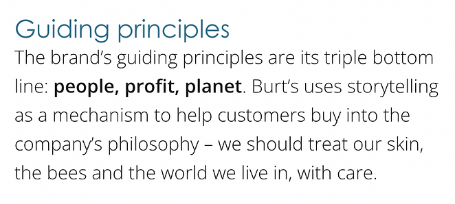
My team and I wanted to focus on Burt's Bees philosophy of beauty of healthy skincare and that it promotes self-confidence of young females shown through storytelling.
2. GOOD AND WELLNESS LIVING
My team and I discussed that young females educate themselves about caring for the environment through the use of natural beauty products in their daily routines. Starting with what they choose to put on their skin, they can lead a healthy and balanced lifestyle.
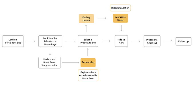
USER FLOW
Starting on the landing page, consumers are prompted to look for skincare products OR keep exploring the website which narrates (storytelling) the company's brand values and like-minded consumer experiences with skincare products.
We designed our user flow like this because consumers exploring the Burt's Bees website either want to purchase a product, or find useful information for their shopping needs. Hence, why we wanted to give options of flexibility that will bring confidence and engagement to our audience.
DESIGN PROCESS
1. Questionnaire
For our first idea, I helped my team create an interactive questionnaire in order to engage the customer journey to find skincare products on the Burt's Bees website. I created quick buttons displaying the default, hover and click transitions, alongside a "Need Help?" pop-up that prompts the user to understand how to complete the questionnaire.
My team and I chose to design this way because we wanted to give our audience an option to find natural, skincare (lip balm) products if they were confused where to look.


2. Interactive Flip Cards & Customer Review World Map
Our team received feedback and dropped the questionnaire idea to explore more interactions and create a story. I designed a flipping card interaction that displays natural, skincare products and a world map to show global, customer reviews in order to bring confidence to our audiences' choices of Burt's Bees products.
CHALLENGE: With the limitations on Figma prototyping, it was difficult for me to design the world map as I had initial ideas of a 3-D Google Earth interaction. I conquered this challenge by designing a 2-D alternative in order for our audience to hover and click through the continents and see categorized reviews from those areas.
I chose to design the flipping card interaction as a method for consumers to quickly see product information faster than click into each card. I also designed the the 2-D world map with a hover and click motion to keep the consumer engaged with the customer reviews and have the confidence of products.


FINAL OUTCOME AND TAKEAWAYS
The final outcome of the project presented a new perspective for me about how tedious and time-consuming user flow design, but gave opportunities to research on an e-commerce company and display my interaction design skills. If I were to re-create this research project, I would definitely consider a consistent style and theme for the entire website (product page) and explore more ways to showcase the customer reviews.