
CoziDi: Logo Design
Design a logo (shown in the CoziDi: Brand Guide Book) for a new online company, CoziDi (July 2023).
My skills for this project involved using my graphic design skills to create a logo design on Figma. I also experimented with different typography and colours throughout the logo design process.
In this project, I designed logo and brand identity for an online, e-commerce company, CoziDi, for my co-op client (the No. 1 rated furniture store in Richmond, BC, Home Quarters Furnishings). I also supported my client's representation of the company in an orginal logo design. I received feedback from my client and iterated work until completion.
The objective of this project was to design a logo for a new e-commere company on selling furniture products online (represented in a Brand Book). I worked alongside my co-op supervisor/client, the No. 1 rated furniture store in Richmond, Home Quarters Furnishings, to identify CoziDi and establish the logo and identity for this company.
DISCLAIMER: This logo design has the rights to be owned by CoziDi and Home Quarters Furnishings.

Our Target Audience
My client's target audience was mainly on the locals in the Greater Vancouver, BC areas. They wanted to serve the middle class public (ages 25-35 year old). What I helped my client with was to describe that the local customers will have opportunities to shop on CoziDi online, plus having the option to see the product in-person at the Home Quarters Furnishings showroom, boosting the confidence of customers' shopping experience.

Online Research & Scope
Part 1: Learning Logo Design
I had some background information on how to design a logo, but I knew I needed some help in creating a logo that was going to be designed for a brand new, e-commerce company with goals and ambitions.
I learned that a good logo design needs these give principles according to Webflow Blog which helped me a lot when working on the logo.

Part 2: Choosing Colour
Colour represents a brand's identity, therefore this also applied to my logo design. I found some very insightful information about the colours represented in logos from Johnny Levanier in his article, Logo colors: what’s best for your brand?
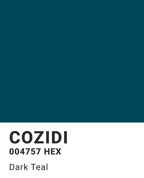
I was drawn towards the Blue-Green colour because according to Lavenier, blue represented "trustworthiness and maturity", and green with "strong cultural associations".


My client wanted to have their company trusted by their targeted, mature audiences that lived in the local areas (cultural associations) of Greater Vancouver. Therefore, this gave me the confidence to choose this Blue-Green colour or "Dark Teal" for the logo.
Design Process
Part 1: Japanese Logo Inspiration: Kashiwa Sato & Uniqlo
For the logo design process, my client wanted a very simple and minimalistic design. In the first stages of my design process, I got inspiration from a Japanese, graphic designer, Kashiwa Sato, and his creation of his Uniqlo logo design.
According to the article by Design Bro, Kashiwa Sato Reveals His Secrets In The Graphic Design Industry, they mention from their interview with Sato that Sato's style of designs are: "playful and witty" and "he favors 'simplicity' because he wants his artworks to be user-friendly".

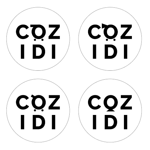
Keeping this design inspiration in mind, I began conducting a series of different layouts with CoziDi's name (rectangle and circle), mimicking the famous Uniqlo design layout. However, to keep it original, I titled the letter "D" and added some character to represent a person "laid back" and/or "feeling comfortable" which is what I wanted to represent CoziDi's brand identity about.
Here are some examples from my design process:


I checked in with my client and they were not a fan of the angled letter "D", and I knew the process was going to be a design challenge.
They gave me feedback about wanting a more symmetrical logo than having one letter titled and asymmetrical (hence, last bottom-right logo). I took on the challenge by iterating my work again and I wanted to see if I could alter another letter in the company name, like the letter "O", slowly representing it as a shopping cart. I checked in with my client and team and they could not understand the intent. I discarded that idea and went back to a one word design.
Part 2: Restarting and Developing the Final Iteration
Days working my logo design, I continued iterating and checking in with my team, who evidently did not feel like the logo was working at all. I felt frustrated and almost wanted to give up.
Instead, I remembered my teammate mentioned about the idea of a recliner (as the company would carry reclining sofas/chairs and furniture. The letter "C" was the chosen idea and the final push in my iteration process.
I was debating whether a long "C" or short "C" would be the best fitting for the logo, however what struck me was the elegance of the longer "C" than the cutesy, childlike short "C", and the thinner lines highlighted the elegance and maturity of the logo for a mature target audience. As a result, I finally made my decision with the CoziDi logo.

Final Mockups
As mentioned in the CoziDi: Brand Guide Book, I helped my client establish rules on how the logo is meant to be used and for what situations. Attached below are some of the key points where the logo is used and mentioned:


